Select
No accessibility annotations are needed for selects, but keep these considerations in mind if you are modifying Carbon or creating a custom component.
What Carbon provides
Carbon bakes keyboard operation into its components, improving the experience of blind users and others who operate via keyboard. Carbon also incorporates other accessibility considerations, some of which are described below.
Keyboard interaction
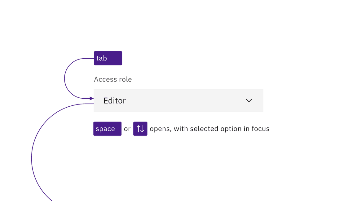
A select component is reached by Tab and opened with Space, or the Up or
Down arrow keys. The currently selected option will have focus. The arrow keys
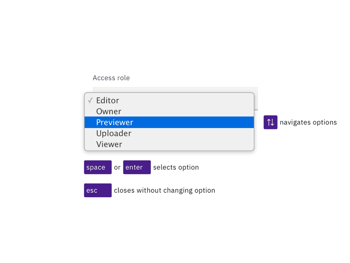
are also used for navigating between options. Users can jump about in the list
by pressing individual letter keys, which will reposition to the first option
beginning with that letter. Options are selected with Space or Enter keys,
which also close the select. Pressing Esc closes a select without changing the
selected option.

Selects are reached by Tab. Space and arrow keys open the list of options.

The arrow keys navigate the open list of options, with the Space or Enter keys selecting the option with focus and closing the list. Esc closes the list without changing the option.
Development considerations
Keep these considerations in mind if you are modifying Carbon or creating a custom component.
- Carbon uses the combined attributes
disabled,hiddenandselectedin order to make a default prompt such as “Choose an option” not appear in the list of options when the select is open. - The component is built on the HTML
selectelement, and so has limited styling, with most of the visual appearance coming from the browser.